KYUUKEIRedefining the quickservice dining experience
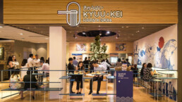
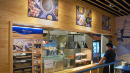
Kyuu-kei, which means rest stop in Japanese, is a Japanese-style, quick-service restaurant specialising in udon and soba dishes.
Our scope of work includes the naming, branding, packaging, and overall design direction for the brand.
The concept for the brand is Japanese-inspired, paired with a fun modernity. The blue colour scheme adds a touch of tradition, inspired by the common colour used for noren, the traditional fabric dividers hung in the doorways of Japanese shops.
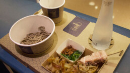
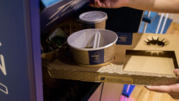
A proprietary one-use tray was also designed for dining in as well as takeaway orders. The tray compartments are made to hold each cup and bowl perfectly, resulting in a neat set meal look. It is also flattenable when not in use, freeing up valuable storage space.
ClientKYUUKEIServicesBrand Strategy, Packaging InnovationYear2016Link-


